
Color That Lifts Your Look
Find shades and combinations that make getting dressed feel more like play. A color can catch your attention before you know what you want to do with it. The blue of a blouse in a shop window, the deep red in a patterned scarf, the green of a dress passing through a doorway: for a moment, you imagine the shade in your own wardrobe. Then the familiar hesitation arrives. Is it too bright? Would it suit me? What would I wear with it?
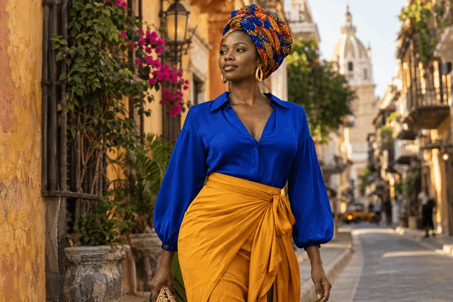
Find shades and combinations that make getting dressed feel more like play.
A color can catch your attention before you know what you want to do with it. The blue of a blouse in a shop window, the deep red in a patterned scarf, the green of a dress passing through a doorway: for a moment, you imagine the shade in your own wardrobe. Then the familiar hesitation arrives. Is it too bright? Would it suit me? What would I wear with it?
You do not need a complete color system to begin answering those questions. Start with curiosity and something you already own. Hold the shade near your face, place it beside your favorite trousers, or try a small amount in an accessory. Your response can be specific and immediate: you like the contrast, you prefer a softer version, or you enjoy the color more away from your face.
For Black women, advice about color sometimes becomes another set of broad assumptions. There is no single skin tone, undertone, or preference that describes us all. Deep, light, warm, cool, muted, and vivid shades can be explored without assigning an entire group one palette. Your own eye, comfort, and taste deserve a role in the decision.
Begin with the colors you notice naturally
Look beyond fashion for a moment. Which colors do you choose for flowers, notebooks, interiors, or artwork? Which combinations make you stop and look? You may find preferences you have not yet allowed into your clothing. A love of warm terracotta or rich blue does not have to remain confined to the objects around you.
Choose one shade to explore rather than trying to transform the whole wardrobe. Find a scarf, top, or other piece you can try with familiar clothes. If you are uncertain about a large area of color, begin with a smaller one. A pair of earrings or a patterned detail can offer a manageable experiment.
Notice the version of the color you prefer. Blue includes pale, grayish, bright, greenish, and deep varieties; pink can be dusty, warm, cool, or intense. Disliking one example does not mean you cannot enjoy the entire family. Often, the useful discovery is a particular shade rather than a broad color name.
Keep claims about mood modest
Psychologists Andrew J. Elliot and Markus A. Maier's review of color psychology (https://www.annualreviews.org/content/journals/10.1146/annurev-psych-010213-115035) examines research on color and psychological functioning, while noting methodological challenges and the need for further work. It does not provide a reliable wardrobe prescription in which a particular shade guarantees confidence, happiness, or success.
You can still take your own enjoyment seriously. If wearing yellow pleases you, that is useful personal information. If a color reminds you of an uncomfortable uniform or an unhappy period, that association may shape your response. These experiences do not need to become universal rules in order to matter when you get dressed.
The phrase “lifts your look” can be understood simply: a color adds interest, contrast, or a quality you enjoy. It is an aesthetic invitation, not a medical claim. You are free to notice how an outfit feels without asking it to regulate every emotion you bring into the day.
Use familiar pieces as a starting point
A new color is easier to evaluate beside clothes you already understand. Try a bright blouse with your usual jeans or a deep green layer over a simple dress. The familiar pieces give the outfit a stable starting point, so you can judge the new shade without changing everything at once.
Neutrals can provide options, but they need not be limited to black and white. Depending on your wardrobe, navy, chocolate, cream, gray, olive, or camel may function as useful companions. Look at the colors you repeatedly wear together. Your own reliable combinations are more practical than a generic list of supposedly essential shades.
If black makes a bright color feel sharper than you want, try brown, cream, or a softer gray. If a pale combination feels too quiet, introduce a deeper shade. These experiments are ways of adjusting contrast. There is no correct result beyond an arrangement that suits your taste and purpose.
You can also use denim as a familiar base. A blue jean, skirt, or jacket may connect with many colors already in your wardrobe. Notice the particular wash and finish, since a dark, crisp denim can create a different effect from a pale, worn one.
Let a print suggest the next combination
A patterned scarf, skirt, or blouse often contains a ready-made conversation among colors. Choose one shade from the print and repeat it in a plain piece. You might pair a burgundy detail with a bag or draw out a small cream shape through a shirt. The repeat can make the outfit feel related without requiring a perfect match.
Start with the less obvious color if you want a fresh effect. A print dominated by blue may also contain a little orange, green, or brown. Bringing forward that smaller detail can change how you see the whole piece. It is a useful way to find new combinations without buying another patterned garment.
If you enjoy mixing prints, look for a relationship in color, scale, or mood. Try the pieces together and step back. You may prefer one print to be visually quieter, or you may enjoy a richer mixture. Treat the result as an experiment rather than a rule you must defend.
When a pattern comes from a particular maker or cultural tradition, learn what you can about it. Accurate names and credits can make your appreciation more thoughtful. Avoid assigning a sweeping story to a design simply because its colors or shapes seem familiar.
Explore one color in several textures
Wearing related shades together can create a calm, continuous effect while still allowing variation. A chocolate knit with brown trousers, or a cream blouse with an ivory skirt, may appeal because the textures are different. The pieces do not need to be identical to look intentional.
Pay attention to the balance between matte and reflective surfaces. A satin blouse may make a color appear different from the same shade in a knit. A textured jacket can introduce depth into an otherwise simple combination. Light, material, and movement all influence what you see.
If two near-matching shades feel awkward together, try separating them with another color or choose a more noticeable contrast. You do not have to force a tonal outfit simply because the idea sounded elegant. Your response to the actual garments matters more than the name of the styling technique.
A single-color outfit can also be practical for accessories. It may give a favorite earring, scarf, or bag more presence. Alternatively, you can keep the accessories quiet and enjoy the effect of the clothing itself. Both approaches leave room for your preferences.
Look in ordinary light
Shop lighting and phone screens can change how a shade appears. When possible, look at the garment in daylight as well as indoors. If shopping online, remember that the displayed color may not be exact. Check return conditions when the shade is central to your decision.
Try the color near your face with the hair, glasses, and makeup you normally wear, if any. You are assessing a whole appearance rather than an isolated fabric sample. Notice what you like instead of searching only for flaws. The question is whether you enjoy the effect in conditions that resemble your life.
If you admire a color but dislike it near your face, place it elsewhere. Trousers, a skirt, shoes, or a bag can let you enjoy the shade in a different way. You do not need to banish a favorite because one placement did not please you.
Formal color analysis can be an optional styling service for people who enjoy that kind of guidance. It should not become a reason to distrust every preference outside a prescribed palette. You can use advice as a starting point and still choose a color because you love wearing it.
Make a small, useful record
Photograph combinations that work and note the actual pieces involved. A private folder can help you remember that the blue blouse looked good with brown trousers or that a particular scarf connected several items. This is more useful than saving hundreds of unrelated images and forgetting what you liked about them.
Keep the record flexible. Colors may feel different with a change in hair, season, setting, or personal taste. You can revisit an old combination and decide it no longer interests you. A palette is a tool for getting dressed, not a contract with your former preferences.
Before buying another item in a shade you like, ask how it differs from what you already own. A second piece may be useful, but repeated attraction can also lead to a wardrobe full of nearly identical purchases. Sometimes a new combination offers more interest than another version of the same garment.
Let the experiment remain enjoyable
You may try a bold shade and decide you prefer it in small doses. You may discover that a color you avoided feels unexpectedly natural. Either result is useful. The purpose is to become more familiar with your own taste, not to prove that you can wear every color with equal enthusiasm.
If someone else dislikes the combination, consider whether their comment contains practical information or simply reflects a different preference. Style leaves room for disagreement. You can appreciate another woman's eye without giving it authority over every choice you make.
The next time a color catches your attention, stay with that first moment of interest a little longer. Imagine it beside something familiar. Try it on if you can. Perhaps it will become a favorite, perhaps only a passing pleasure. Either way, you have allowed yourself to look, to choose, and to find a little more possibility in getting dressed.
© 2026 TopBlackBeauty.com

As a passionate news reporter, I am fueled by an insatiable curiosity and an unwavering commitment to truth. With a keen eye for detail and a relentless pursuit of stories, I strive to deliver timely and accurate information that empowers and engages readers.
Comments (0)